
Attract Customers On The Go With Your Mobile Website
Restaurant Engine ensures your restaurant’s site works flawlessly on ALL mobile smartphones and tablets

Did you know: Mobile devices like the iPhone, iPad, Androids, and other smartphones and tablets account for 56% of all Internet usage? And mobile web usage continues to grow year after year.
Having a mobile-optimized website is more crucial than ever — especially for restaurants, whose customers are already out and about, using their smartphones to search for a place to dine.
Mobile Optimization That’s Future-Proof
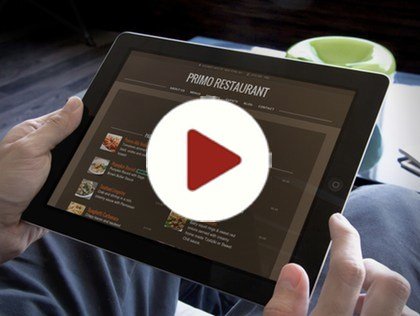
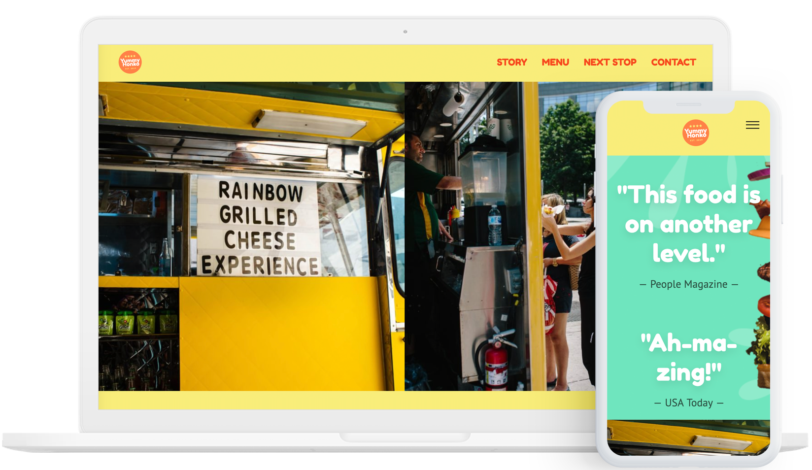
Restaurant Engine ensures your restaurant’s website looks and functions beautifully, whether you’re viewing it on a notebook computer, on your iPad, or on a smartphone in the palm of your hand.
Kiss any mobile website problems you’ve had before goodbye for good. Using the technique known as Responsive Web Design, your website scales and adapts to fit any screen size, any device — even devices that haven’t hit the market yet! It’s truly future-proof.
Unlike other solutions, which require you (or your customers) to download or install extra apps in order to activate “mobile mode”, Restaurant Engine’s mobile-optimization is built right into the website design itself.
No Apps Required. Mobile is Built-In.
That means there’s no additional work required by you, or your customers. Nothing else to install or activate. No matter where someone views your website, or which device they use to view it…
it just works.
Restaurant Web Design, Made Easy.
See what so many restaurateurs are raving about.
“The feature I like most about Restaurant Engine is the mobile optimization and simplicity of setting up the site”
Motti
Melbourne, Australia