Design Template Spotlight: “Primo”
In our Design Template Spotlight series, we will feature individual templates from the Restaurant Engine collection. Remember, Restaurant Engine members have access to all of our website templates — present and future!
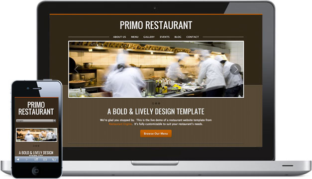
Today’s spotlight is on Primo, the early favorite among Restaurant Engine customers. The Primo website template is one fine looking design. This bold and lively look and feel is sure to entice visitors to dig in for more.
Designed by Vancouver-based designer, Eduardo de La Rocque, we’re proud to offer our customers this premium design template.

Like all of our templates, Primo comes with 8 built-in, pre-design color schemes. They provide a good range of moods. For instance, the sweet and tangy, “Honey BBQ” color palette could work great for a sports bar or family grill restaurant. Or the “Vintage” color palette, which might work well for a traditional Italian restaurant website. Then there’s the “Crest” color palette… Suddenly I’m in the mood for sea food 🙂
Of course, if you can go ahead and tweak individual colors to your heart’s content.

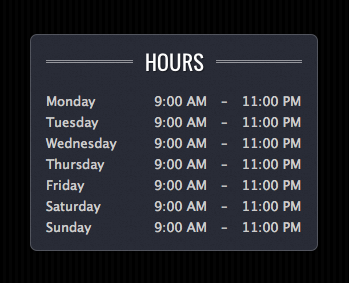
The Primo website template comes packed with design details that draw interest. Like the double-line headers found at the top of all widgets. And the subtle background textures, shifting between brushed textures and a solid line pattern.
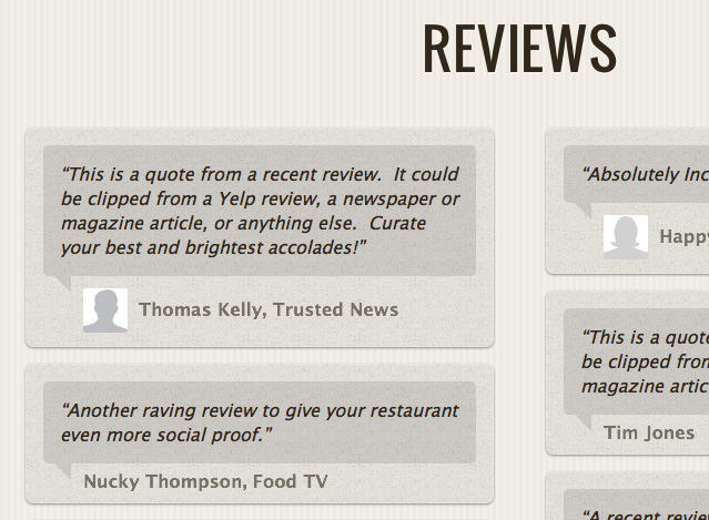
Every section of this template comes with unique bells and whistles, like the Reviews page, showing speech bubbles for your curated restaurant reviews.
What do you think?
What are your impressions of the Primo Restaurant Website Template? I’d love to hear what you think…


Leave a Reply