10 Food Truck Design Ideas that Invite More Profit

Create a unique vibe for your food truck to increase your business.
Food trucks are continuing to rise in popularity.
You may have noticed an increase in the number of trucks roaming your city, and according to one source, that trend is sure to continue.
Whether you own a food truck, or you’re thinking about starting one, your end goal is profit.
The design of your food truck plays a large role in bringing you business. It’s often the aesthetics of your truck, along with the smell of your food, that entices customers to your window.
To help you grow your business, let’s look at 10 food truck design ideas that invite more profit and ultimately your success.
First, let’s look at the importance of design.
What Drives Customers to Your Food Truck?
If you are parked in a group of five-ten food trucks, ask yourself what brings customers to your truck. What makes them choose your food truck and not your neighbor’s?
The design choices you make for your food truck can subconsciously attract customers to your window.
For example, the colors you choose can work to convince a customer to choose your food truck over another.
Your goal is to stand out from the crowd and appeal to your customers through your design aesthetic. This is a combination of things including sight and smell.
The way your truck looks tells your customers about the taste and quality of your food.
Now that you know the importance of food truck design, let’s look at some ideas that invite more profit.
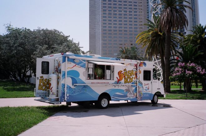
#1: Wrap the Entire Truck
When it comes to the outside of your truck, you can either paint it or wrap it.
Wrapping your truck is usually a more expensive option, but it tends to stand up better to weather and can be replaced if needed.
If painting your truck, you want to hire a professional graphic designer/painter.
Logos, text and graphics really pop when you wrap a truck. You have many more design options then if you were to just paint your truck.
Another tip is to wrap more than just the body of the truck. Wrap the entire thing – the roof, window, doors, and more.
Why would you want to wrap the roof? If you’re parked downtown under a high-rise building, this is great advertising space. You’ll attract the people on the top floors with your enticing design.
Consider adding your logo and website address on the roof along with some words indicating this is “the place for them to eat.”
#2: Create a Festive Vibe
Another way to enhance the design of your truck is by improving the ambiance.
You can do this by adding music that works with your food truck theme.
You want to make people feel like they’re on vacation when visiting your food truck. (tweet this) Help them feel like they’re stepping outside the ordinary with music, and that they’re going to enjoy something really special when they step up to your food truck counter.
#3: Construct a Unique Truck
Another way to enhance your design to invite more profit is to build out your truck so that it matches your brand.
For example, if you sell only chicken dishes, you could make the structure of your truck look like a chicken. Likewise, you could hire someone to make your truck look like a pig if you’re a barbecue truck.
Let your creative juices flow and consider ways you can enhance the physical structure of your truck.
#4: Highlight Your Menu
Your food truck menu is part of the overall design of your food truck. In fact, it’s much more than a chalkboard displaying your menu items.
You want your menu to match your food truck branding and design so that it works with your overall theme and stands out.
If you’re in a crowded food truck park, and you want your menu to stand out from several feet away, it should be professional looking and easy to read.
This doesn’t mean you have to have a pre-made sign, especially if your menu rotates. Bottom line – use the right materials to make your menu look good and stand out a distance.

Entice customers with your great smelling menu items.
#5: Use an Awning
It’s no fun for customers to stand at your window and try to order food in the rain or in the blazing sun.
Add an awning to improve the customer experience.
You might find that on a hot summer day, customers move to the trucks that provide shade and comfort.
#6: Add a Digital Billboard
Using a small television, you can highlight your menu in real time. Attract customers walking by with some digital advertising.
Get creative. Use a digital format to highlight your menu, your story, or the way you cook your items if it’s special (think a giant Wok or special cooking technique).
Use the digital format to draw customers in.
#7: Match Your Design to Your Food
When designing your truck for added profit, think about the whole picture.
Does the design of your truck accurately portray what customers will find when they look at your menu?
For example, if you serve down-home barbecue, you probably don’t want a pastel-colored truck.
Give customers a feel for what they’re going to get by the design of your truck.
#8: Utilize Lighting
Another trick to improve profits is to create ambiance with lighting.
This can be as simple as hanging string lights from your truck or on your tables.
You can also consult with a designer on how to “light up” your truck. You can use lighting to highlight your logo or your window.
Check out the Rocket Truck as an example.
#9: Select the Right Colors
When choosing your colors, they should first match your brand and second work to improve your profits.
Generally speaking, warm colors like red and yellow say your truck is outgoing, energetic and unique. Red encourages a more passionate response.
Cool colors like blue portray a brand that is upscale, trustworthy, calm and reserved.
If you use green as the base of your truck, you tell customers your food is healthy and fresh.
You can of course increase the colors to change the vibe – just know what works for your target customer.
#10: Don’t Forget Your Logo
Finally, your logo must be big, bold and easily readable.
Use colors that match your brand and fonts that can be read at a distance.
Your logo helps you get repeat business as well, so it must be easily recognizable and work with your menu.
Final Thoughts
When designing your food truck, it pays to give attention to the details.
Here are a few things to consider along with the design ideas we’ve discussed:
- Color matters. It can help create your brand and tell customers what to expect when ordering your food.
- Design should be original. You want to stand out from the crowd in a positive way.
- Think about the physical structure of your food truck. Is the window big enough? Is it accessible?
- Address your logo and important information. Is your logo very visible? Do you have your website, phone number and social media page(s) listed? Is the writing too small or cluttered or easily readable?
Take these tips into consideration when designing your food truck to invite more profit, new customers and repeat business.
Finally, remember that you don’t have a second chance to make a good first impression. The look of your truck is vital to your success as customers will decide in the first 10 seconds if they’re going to queue up for your food. (tweet this)
Every food truck needs a high-quality website to extend the truck’s design aesthetic to the digital world. At Restaurant Engine, we create great, responsive websites. Ready to take the plunge and create a website with your food truck’s online menu and important information? Get your free website consultation today!
Images: Phillip Pessar via Visualhunt / CC BY and Lluis Domingo

Great article. Thank you for sharing. I didn’t know, that there is so much design patterns for trucks 🙂