Mobile Websites Are Not For Everybody
Most businesses don’t have a great mobile website. And guess what? Most businesses don’t NEED a mobile website.
If your customers don’t use smartphones and don’t need to find your website when they’re on the go, then why bother making sure your website is mobile-ready?
However, if you’re in the Restaurant Business, then it’s a different story. Let me tell about something that happened to my wife and I, just last week:
Since we recently moved from New York City to Connecticut, we love to explore our new neighborhood looking for restaurants to try for the first time.
So last weekend, after some afternoon shopping we decided to look for a restaurant, but wanted to make sure we chose something good. My wife took out her iPhone and searched Yelp for “Italian Restaurant in Norwalk”. A few results showed up, but all had mixed reviews.
She wanted to get a better idea of the ambiance and food menu before coming in, so she tapped the link to view one of restaurant websites on her mobile browser.
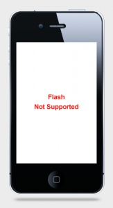
A small message reads: “Your device doesn’t support Flash.”
Frustrated, she tapped back and tried viewing the website of one of the other restaurants that came up.
This restaurant’s website displayed on her mobile browser, but all of the text was extremely small and hard to read. We were walking in the rain so we didn’t have time to “zoom in” and cringe to read the website.
So we decided to play it safe. Rather than trying one of these restaurants, we decided to go somewhere we’ve been before.
Those restaurants lost us as potential new customers.
Make it Easy For Your Customers
If only those restaurants had mobile websites that were optimized for the smaller touch screen (and of course didn’t rely on Flash), we — and probably many other folks using their smartphones and iPads to look for restaurants — would have walked in and filled their tables.
A great mobile website design should do 3 things:
– It should display automatically, on ALL mobile devices.
– It should be easy to read, without having to “pinch” or “zoom”.
– It should load fast, especially on slow data connections.
If your restaurant mobile website does all of these things, you’ll be miles ahead of your competition, attracting more of those customers who are on the go.
At Restaurant Engine, we focus on making sure our client’s websites work great on mobile. Every one of our restaurant website templates has been meticulously optimized for mobile browsers.
Take a look at this video to see what I mean:


Leave a Reply