Does Your Restaurant Website Cater to iPhone Users?
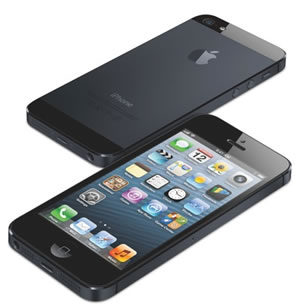 With the release of the new iPhone 5 this month, and the general rise in mobile usage when surfing the Internet, the need for a restaurant website that caters for iPhone users is becoming a requirement, rather than a commodity.
Sources estimate that at least 10% of all worldwide Internet usage is mobile based, with flourishing economies such as those in Asia having seen a 192% increase in mobile website usage since 2010.
It’s for this reason that at Restaurant Engine, all our restaurant websites come complete with a mobile version, intended specifically to allow iPhone and other mobile users to easily find your contact details, view your menu and book a table.
Optimize Your Restaurant Website for the iPhone 5 & Mobiles
To help you ensure your restaurant Website converts mobile visitors as well as it does desktop visitors, we’ve shared three tips below.
Avoid “Pinch and Zoom”
On iPhones, it’s possible for users to “pinch and zoom” with their fingers in order to zoom in on a Web page. While this is a nice feature when required, for the convenience of your visitor (and potential customer) it is something you should try to avoid forcing them to do.
All of our Websites use ‘responsive design’ to ensure the zoom level of the Website is comfortable whether the visitor is using an iPhone, iPad or any other mobile device.
Make it Easy to Contact You
One of the primary uses of a mobile restaurant website is for a user to find your contact details.
“One of the primary uses of a mobile restaurant website is for a user to find your contact details.”
Tweet This!
They may be running late and wish to push their reservation back. Maybe they wish to add an additional person to the seating arrangements and would like it ready for when they arrive? Or they may be struggling to find your restaurant.
There are countless reasons why a customer may try to find your contact details while they are on the move. As a result, it’s important your street address and phone number are at the top of your mobile website.
Use Plain Text on Your Mobile Website
One of the best features of an iPhone is to connect its calls and maps functions to websites. By displaying your phone number and address in plain text rather than as an image, not only do you increase load times of the web page because images take longer to load, you also give iPhone users the ability to quickly and easily call you or locate your address on their built in map app.
iPhones recognize phone numbers and postal addresses and link the text to the appropriate app or function of the fun, giving your visitors to your restaurant website the ability to call you or find your location with one easy touch of their iPhone screen.
A Mobile Website is a Requirement, Not a Commodity!
 Regardless of the three tips above, having any mobile website is better than no mobile website at all. Ensure you cater for all your customers, whether they’re sat at their desk or surfing on a mobile in the back of a taxi.
Mobile usage is not reducing. It is increasing and doing so at an increasingly fast pace. Stay ahead of the trend and ahead of your customers by ensuring you offer a mobile website before you start getting asked by your customers why you don’t have one.
Do you have a mobile website for your restaurant? Do you track how many customers use your mobile version? Let us know by commenting below.
 10 Most Important Questions To Ask in A Restaurant Survey
  8 Things You Can Do To Help Manage Food Costs
  5 Things Startup Restaurants Typically Overspend On
  5 Ways to Deliver Excellent Customer Service at Your Restaurant
  7 Surprisingly Common Problems That Restaurants Face
Excellent Points and Tips for Restaurant Owners.
Mobile Marketing is a Necessity Today.
Thanks for the great information.