Wet Your Customers’ Appetites With Your Restaurant Website Menu
 Your menu, be it online, a take out flyer, or in your restaurant, is your most important sales tool. You could have the right ambiance, the best location, and great staff, but if customers don’t like what they see on your restaurant website menu, you’re going to struggle to fill your tables.
It’s for this reason that your menu is the most important section of your restaurant website. Many restaurant owners take great care in developing a fantastic website home page and then make the mistake of putting little effort in to the design of their menu. And the few that do put some effort in to their website menu often think that ‘great design’ refers to ensuring it contains bells and whistles and looks good, when in fact, it is accessibility and usability that should be focused upon. So while it is all well and good spending time ensuring your menu is attractive to the eye, what really matters is your menu is easy to read and is useful for a potential customer.
Your menu is the most important section of your restaurant website
Below, we have listed some do and don’s for your restaurant website menu, to ensure potential customers are provided with all the information they need to help them make the decision to dine with you.
Improve Your Restaurant Website Menu
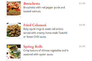
Add Prices – There’s nothing more frustrating when trying to plan a date or a family meal than not being able to judge the price of your meal. Your dishes may sound exciting, but without displaying prices most people will not be enticed to dine at your restaurant.
Provide Descriptions – While surprise is sometimes good, most customers like to know exactly what it is they’re ordering. Don’t make the mistake of just describing how beautiful a dish looks and tastes. Your descriptions must be useful. For example, describing the consistency, texture, level of spice or the portion size will be useful to a customer when they’re deciding what to order.
Display Photographs – Far too many restaurants don’t use photographs to their full potential. One of the benefits of a website compared with a print menu is the space you can fill. Whereas on a print menu you may only have room for a few photographs of your best dishes, with your website restaurant menu you can display photos of every dish. Be sure to make sure they are actual photos of your dishes, rather than stock photography taken from somewhere else.
Display Your Specials – Make a point of separating your specials in to their own section of the menu. Customers are often drawn straight to the specials area, safe in the knowing they have the chefs special approval.
Display Reservation Information – Once a potential customer has viewed your restaurant menu, the next step is to book a table, so be sure to prominently display your contact information and opening hours so they can easily call or book online.
Connect Your Menu with Social Media – Potential customers will often want to share your menu with the people they plan to dine with, so be sure to add social media buttons so your menu can easily be shared via Twitter, Facebook and email.
Add Your Restaurant Menu to External Websites – External websites such as GrubHub and All Menus are an excellent way to position your menu in front of a whole new audience. If you submit your menu to these websites, ensure you remember to update it if you ever change your menu, just like you would with your own website. Be sure to display your website address on these external websites to to increase traffic to your restaurant website.
Mistakes to Avoid With Your Restaurant Website Menu
Do Not Scan Your Print Menu – Scanning a copy of your print menu and displaying this on your website may be an easy and quick way to show your dishes and pricing, but it limits you and is not as useful for customers. Search engines cannot index the content of a scanned image, so your menu won’t display in Google or other search engines as well as it would if you created a custom page on your website with dish names, descriptions and photos.
Do Not Use Small Font Sizes – While it may be tempting to reduce your font size due to the amount of items you have on your menu, doing so reduces accessibility and frustrates customers. Research has shown that a large percentage of people looking at your menu will be doing so on a mobile device such as an iPhone or an iPad, so keeping your font sizes at a reasonable level will make reading your menu an enjoyable experience.
When adding your restaurant menu to your website, keep usability and accessibility in mind. Customers need a menu that is easy to read, that is useful and helps them decide which dishes they will enjoy. Take advantage of the space you have on your website to give as much information as you possibly can, without bombarding your customers with too many distractions and too much choice.

Useful information about the restaurant’s menu
سایپا–نمایندگی سایپا–اقامت ترکیه–خرید ملک در ترکیه
whet not wet