10 Examples Of Crafty And Fun Street Signs!
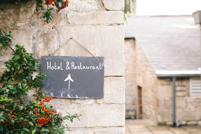
Grab the attention of potential customers with your signage.
Restaurant signage has the unique ability to pull diners in.
And, in our digital age, creative outdoor restaurant signage finds itself on the Internet, in the feeds of Facebook, Pinterest and Google images. So, your outdoor signs matter.
In this article, we look at 10 examples of crafty and fun street signs. Then, stick around as we talk about outdoor restaurant signage in general.
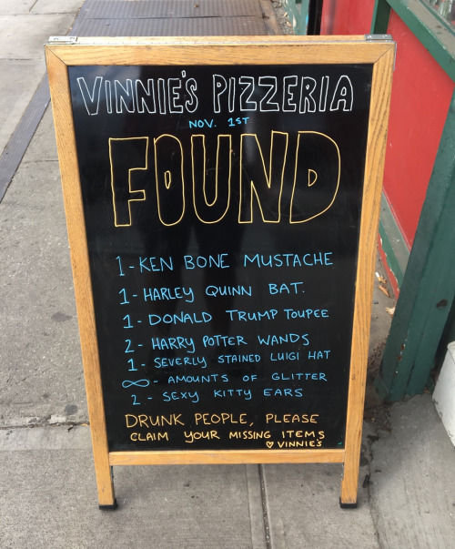
#1: Vinnie’s Pizzeria
We lead off with Vinnie’s Pizzeria in Boston because they are world famous for their signage.
Since they began designing them in 2010, they’ve thrilled and intrigued customers with more than 700 boards.
News media like The Huffington Post and Buzzfeed have featured their signs, and they even made an appearance on Jimmy Kimmel Live.
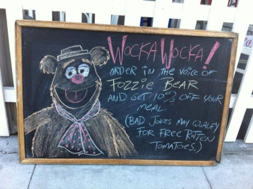
#2: Not a Burger Stand
Crafty and fun is the name of the game at Not a Burger Stand. Their unique signage compels diners to do something out-of-the-box to enjoy a discount or free meal.
They are well known for asking diners to order in the voice of someone famous, like Fozzie Bear, Yoda, Sean Connery and Randy Savage in order to earn a discount.
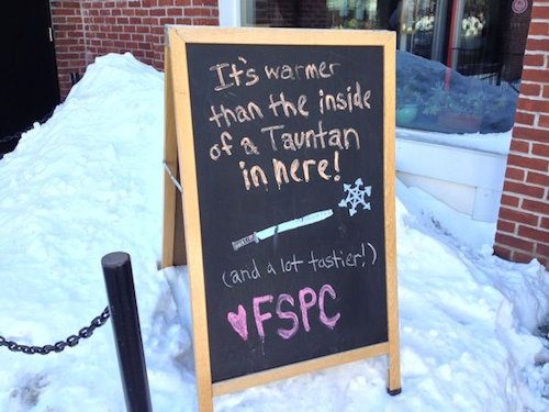
#3: Flying Saucer Pizza Company
If you aren’t a Star Wars aficionado, a tauntan is a species of snow leopard that roams the windswept snow plains of Hoth, domesticated by the Rebel Alliance.
So, in this creative sign, they are promising to be much warmer and tastier than a tauntan!
Visit Flying Saucer Pizza Company
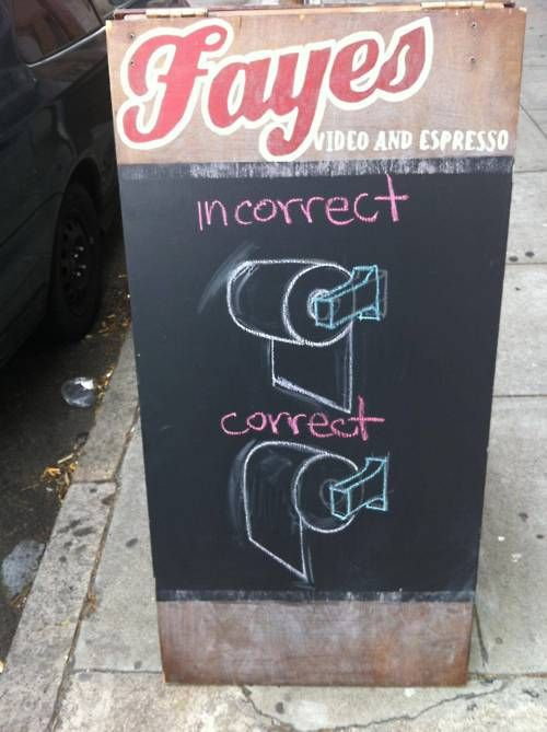
#4: Fayes Video and Espresso
One might wonder what the proper position of toilet paper on a roll has to do with a coffee shop, but this is one business that’s willing to take craftiness to a whole new level.
After looking at this sign, which way do you think is the right way?
Visit Fayes Video and Espresso
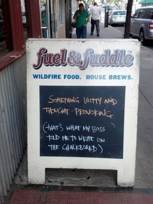
#5: Fuel and Fuddle
You’ll find a cup full of playful sarcasm in their outdoor signage.
Yet, once you walk in the door, this gastropub is full of ambiance and delicious food.
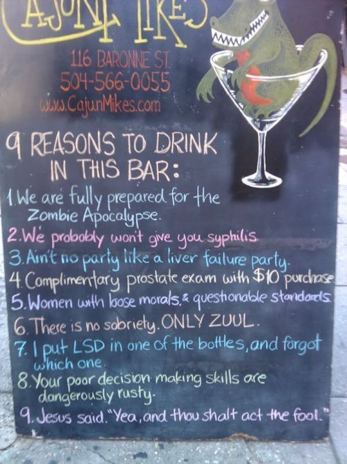
#6: Cajun Mikes
A unique New Orleans spot, diners and drinkers can rest assured the place is not only prepared for the zombie apocalypse, but they’ll find a dose of fun inside.
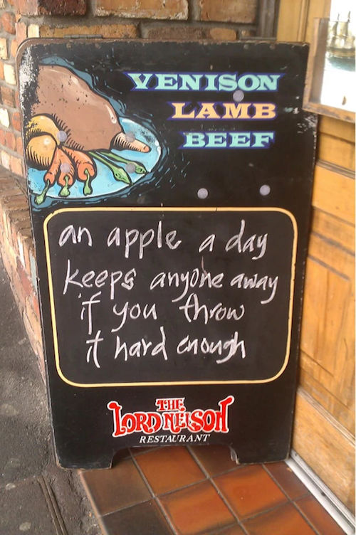
#7: The Lord Nelson Restaurant
Serving aged steaks, fresh seafood and plenty of wine, The Lord Nelson Restaurant subtly lets diners know they won’t find any fruit inside.
Or, they just decided to write a clever statement in the hopes of attracting passersby…
Visit The Lord Nelson Restaurant
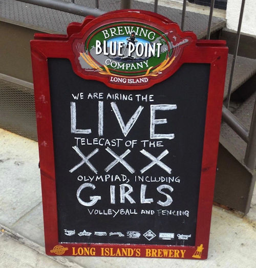
#8: Blue Point Brewing Company
No, they aren’t advertising XXX girls, but they are promoting the Olympics including girls’ volleyball and fencing.
It’s amazing what a slight change in font size and design can do to catch the eye.
This crafty and fun sign surely brought the customers in for their delicious New England fare.
Visit Blue Point Brewing Company
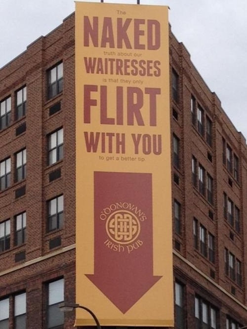
#9: O’Donovan’s Irish Pub
Another twist that uses large and small fonts to attract the attention of potential customers is O’Donovan’s Irish Pub.
While a more permanent fixture than the typical chalkboard sign, this restaurant enhances their branding with this crafty sign and entices their customers.
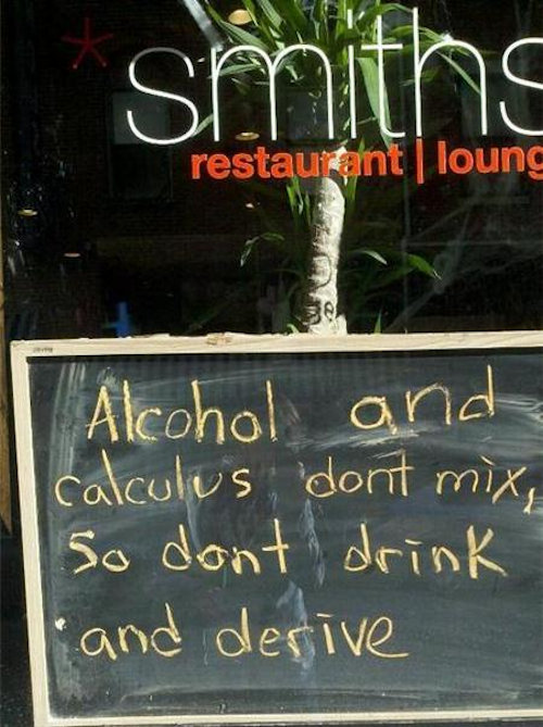
#10: Smith’s Restaurant and Lounge
Are you the math type?
Then, this outdoor chalkboard surely appeals to your sense of mathematics! It’s another example of a cute sign used to lure diners in.
Visit Smith’s Restaurant and Lounge
Now that we’ve looked at 10 examples of crafty and fun street signs, let’s discuss ideas for your more permanent restaurant signage.
Keep to Your Branding
You know that the story of your restaurant, the design of your logo, your colors as well as the theme inside your restaurant should all work together.
This is also true of your more permanent signage. Use your outdoor signs to let customers know what they’ll find when they walk inside. (tweet this)
For example, if you are a fine dining establishment, your sign should reflect that in its design, color and materials.
Consider your outdoor signage as part of your overall branding and marketing strategy.
Plan the Size and Visibility
When creating your outdoor sign, you want to not only check on local ordinances and regulations concerning size, but you want the size to again fit with your overall theme.
If your sign is attached to your restaurant and not free-standing, it shouldn’t compete with the windows, doors or front of the restaurant. Everything should be in balance and work well together.
Think about if or how your sign should be lighted and its location with regards to the street and your restaurant.
The most important thing about your sign is that it is visible from the street. Your choice of colors, logos, images, fonts, direct lighting or back-lighting will all affect its visibility.
Consider the style of your restaurant when choosing the size of your sign and the shape of your sign. This will increase its visual appeal.
Think About Day and Evening
Many restaurant owners only think about their sign being visible during the day.
It’s important to make sure it’s equally visible during the night time hours. Whether you serve food at night or not, you still want to advertise your presence to potential customers at all hours.
Options include LED signs that are bright and can be seen in direct sunlight as well as the dark. You can also use overhead lighting or direct lighting to highlight the sign.
Consider Alternate Views
Another thing to think about with outdoor signage is the alternate view. Not everyone comes at your restaurant from the same direction. Other times, cars or plants may block the view of your restaurant.
Consider all the views and think about using other forms of signage to showcase your restaurant. You might put a sign at eye-level, on top of your restaurant, on the awning or place it sideways.
Think about all the angles you need to cover.
To Conclude
Clever, crafty and fun street signs are a great marketing strategy for your restaurant or café. (tweet this)
Not only can they draw diners in, but when the signs make people laugh, your customers will remember your restaurant the next time they are going out to eat.
Use your street signs to inspire your customers and make them laugh, and you’ll do much towards promoting customer loyalty.
Have you seen a unique, crafty and fun street sign at one of your local restaurants? Please share below. We’d love to see what else is out there.
Images: Jason Briscoe and Patrick Tomasso

Leave a Reply