10 Amazing Restaurant Logos

Logo design is important for restaurants.
There is a ton of competition in every town when it comes to restaurants. Standing out is important in order to compete with all the others in the area.
If you’re looking for inspiration for your restaurant logo then this is the post for you. The idea is for these logos to give you inspiration and direction on how to create your own restaurant logo.
1. The Livery
Also known as the Cowtown Saloon, The Livery opened just a few years ago in Eau Claire, Wisconsin. The building is an old horse livery, which is where horses were stabled and cared for back in the old days.
The Livery Logo
Style. You immediately understand what you’ll be walking into when you see this logo. The font has a western feel and the color is faded. It makes you feel like you’re walking into a saloon in some cowboy town in the Old West.
2. Little Star Pizza
Little Star Pizza specializes in a variety of different pizzas including deep pan dish pizza. You’ll find the basic ingredients for pizzas like cheese, sausage and pepperoni, but you’ll also find interesting blends and specialty pizzas.
Little Star Pizza Logo
Going with a fun play on the name of a restaurant is tricky for the logo. Little Star Pizza pulls it off. They log includes a full pizza with a slice taken out and a little star in the middle. It’s fun and appealing. You immediately know you’re looking at a pizza restaurant.
3. Chicks ‘n Salsa
It’s hard to get good Mexican food in the North, but Chicks ‘n Salsa provides some great food for the folks in the Chicago area. This restaurant has been around since 2005 and in that time they’ve become one of the best places in the city for Mexican food.
Chicks ‘n Salsa Logo

The colors are important for restaurant logos. In this case you have great use of bright reds and yellows. The logo is fun, but more than that you notice the colors right away. It stands out when you’re looking at a variety of restaurant options.
4. Over Easy
If you’re looking for a great place to eat breakfast and you’re in Phoenix you can’t find a better place than Over Easy. There are unique items on the menu and the classic breakfast favorites are cooked in a way that will leave you wanting more.
Over Easy Café Logo

It makes you do a double take and in the business world that’s a good thing. You first notice this logo because it’s different and after a few moments you realize that it’s obviously for a breakfast restaurant. That’s the way to win over customers by first getting their attention.
Being different is how you can win over customers by first getting their attention.
5. Mosaic Wine Bar
Mosaic Wine Bar is one of the best places to stop and have a drink and a little bite to eat in San Diego. The location is pretty new, but the style is different. It’s a casual place to come in and enjoy a good glass of wine with friends.
Mosaic Wine Bar Logo
Something you need in the restaurant business is something different. Mosaic didn’t go with the traditional look for its logo. Every wine bar and winery has a classic, traditional logo. Mosaic instead went with something funky and fresh. It really stands out and sets the tone.
6. Palomino
There is a mixture of foods to find at Palomino. The cooking is centered on the Urban Italian concept with different recipes from that region of the world. There are locations all around the US including Seattle and Dallas. It’s a great place to get a fine dinner.
Palomino Logo

It’s a funky little horse design. It’s weird and it makes you give it a second look, but the logo still gives off the sense of fine dining. That element is important for a restaurant that needs to communicate the style the visitor can expect when they walk through the front door. Red is just a great color for getting attention too.
7. The Salt Lick
The Salt Lick is one of the best barbecue places in Austin, Texas. In fact, if you read some interviews around the web you’ll find that it might be one of the best barbecue joints in all of Texas. That’s quite the accomplishment, but a deserving one if you believe the regular customers.
The Salt Lick Logo
Barbecue logos are tough. You could go with something on the cartoon side, but I like the way The Salt Lick went. It’s got an aggressive feel. The logo has strong lines and strong colors. It’s a bold looking logo and I’m guessing that bold look matches the bold flavors in their barbecue. It’s making my mouth water just looking at this logo.
8. Hell’s Kitchen
Hell’s Kitchen offers some unique food and if you’re ever there you need to try their homemade peanut butter. You’ll find yourself taking spoonfuls of it down before your dinner even arrives. But be sure to save room for the main course because there is always something special every time you visit. They are also known for their breakfasts.
Hell’s Kitchen Logo

Type is such an important aspect of all design including logo design. Hell’s Kitchen nailed it with the type on their logo. It’s an aggressive style type that matches the style of the restaurant. When you walk down the stairs and enter this place you feel like you’re in a cool, dark spot that nobody knows about. The logo successfully communicates that feeling to anyone that sees it.
9. The Fat Duck
The Fat Duck is a different kind of restaurant. It’s recognized around the world as one of the best places to eat. You’ll get some interesting food from one of the best chefs in the world. The reviews are always great, but be sure to come prepared to enjoy possibly the best meal of your life.
The Fat Duck Logo
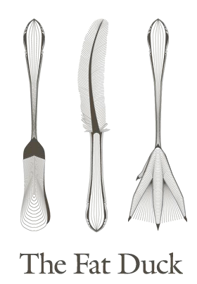
For such a well-known restaurant you need a great logo. The Fat Duck pulls that off extremely well. The utensils of the logo incorporate parts of the duck. You still feel like you’re looking at the logo of a fine dining restaurant, but there are those playful elements that make it approachable.
10. Stack’d
Local is a big trend in eating today. Stack’d uses local ingredients including grass-fed beef from around its Milwaukee, Wisconsin location. You’ll be able to stop in the casual setting and grab a great burger and beer. The restaurant combines good food with healthy ingredients to give you everything you want and need in a meal.
Stack’d Logo
There is something to be said for keeping things simple. Stack’d didn’t go crazy with their logo. They didn’t try to do too much yet the logo stands out. Red was a great choice. It stands out against the city backdrop and gets your attention because it looks interesting. Sometimes simple is the best way to go for a restaurant logo design.
Restaurant Logo Design Basics
Designing logos and even coming up with a concept for a logo is tricky. You want to make sure your brand is represented or created in the right way because this is how people will recognize you. A logo that stands out can be the difference when someone is making his or her decision of where to eat.
If you are looking to have your logo created or redone you’ll want to invest in a good designer. A logo is important and it’s not something you want to cut corners with. Your logo will be around forever so make sure you find the right designer that understand your business.
Here are resources for restaurant logo design:
You can also look to find a local designer if your area. Sometimes someone local can really tap into the audience you’re looking to attract to your restaurant.
Quick Note: Once you get to the point where you need a website remember that it’s important to prominently display your logo at the top of your website (including the mobile version). Your logo is how people will know they’re on the right website. People will search online for you to find your location and to view your meu.
And if your website is with Restaurant Engine, we’ve made it extremely easy for you to place your logo on your website.
If you have questions about restaurant logo design and other restaurant needs please leave a comment or tweet to us!

I think not all of them good enough.. Over Easy is good ones
Over easy is fantastic logo – simple yet clever.
Ya, I like that one best as well.
It really makes you stop and take notice even though it’s a simple concept. Sometimes that’s the difference for people when they’re deciding on a place to eat. Thanks for the comment, Allison.