The Complete Guide to Responsive Web Design For Restaurants
 Have you heard about responsive web design for restaurants?
Maybe you’ve heard the term before or maybe it’s brand new.
Either way, responsive web design is something that has benefits for your restaurant website.
The online world today is changing. People continue to use their desktop computers, including laptops, to browse the web, but tablets and smartphones are also becoming common tools for browsing.
If you think about your customers for a moment there is a good chance they use their smartphone to find information about your restaurant. The person might be getting out of work and looking for a place to eat dinner. They bring up your website on their iPhone or Android device and check out your menu.
In the past, websites have created two separate websites – one for desktop computers and one for mobile devices.
Today, responsive design is what more companies are using as a solution.
Let’s review what responsive design is and why it’s beneficial for your restaurant website.
What Is Responsive Website Design?
Responsive web design makes your website instantly adapted for mobile devices. A user will get nearly the same experience on your mobile website as they would on their desktop computer.
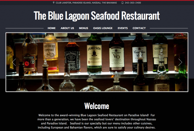
Here is a screenshot of the regular desktop computer website of The Blue Lagoon Seafood Restaurant:
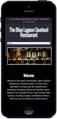
Now, here is the same website on an iPhone:
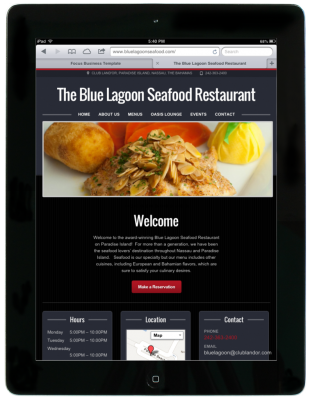
And here is the iPad version:
You can really notice the difference on the iPhone version, which is great for the many iPhone users.
Responsive design adjusts to any screen size and resolution including any mobile devices that might be released in the future. Responsive design is a worry-free solution for the emerging mobile revolution.
What’s nice about responsive design is the website design and experience is nearly the same on every possible device. This makes it easier for people to find what they are looking for when they visit your site.
It’s common for some websites to use a 3rd party application that automatically creates a mobile version of their website. These apps can cost money to use and in most cases the mobile version looks nothing like the desktop version. It’s a poor experience for users and creates additional work for you because you need to maintain your regular website and a mobile application.
A Single Website to Maintain
Responsive design gives you a single website to maintain.
The biggest advantage of responsive design is that there is only one site to manage.
Instead of maintaining a desktop website and a mobile website you can simply have one website that adapts to any device a person might use to browse your website. There is less content to worry about and fewer design updates as well.
No matter what device a visitors uses to view your website, responsive design will adapt and present them with a site that is functional and easy to navigate. It is truly the best experience possible for every kind of user and it saves you time in the long run because you’re only worrying about a single site instead of multiple.
No Need to Create a Mobile App
Some people wonder if a mobile app is the right option for their company. After all, many people that use their smartphones like using apps.
The statistics are mixed regarding the mobile website vs. mobile app debate, but there are benefits to using responsive design for your current mobile solution.
A responsive website design is currently much cheaper than developing a mobile app. Apps are expensive to create and are time consuming as well. While an app might make sense for some organizations it is fiscally the best option to choose a responsive website for most.
Also, if your customers are already used to your desktop website they will be looking for a similar experience on your mobile version. A responsive mobile website will be very close to your desktop version. The mobile version is simply scaled down.
The responsive experience is much more consistent with your website than a mobile app.
The responsive solution will be less expensive and a better experience for your customers compared to a mobile app.
Responsive Web Design for Search and Social
Two important considerations regarding responsive design are search engine optimization and social sharing optimization.
It is important for a restaurant website to be optimized for both of these areas because search engines and social networks will send traffic, which means potential customers in the door.
Search is incredibly important for local businesses like restaurants.
As mentioned above, people are known to use their smartphones to research restaurants. When people are on the move they like to look at restaurants that are close to their location. They want to check out menus and see reviews so they can anticipate how they will potentially like a restaurant.
With responsive design your restaurant website will be completely optimized for search. In fact, Google has endorsed responsive design for the smartphone experience.
Responsive websites are also optimized for social media.
As mentioned above, people are using smartphones more and they’re using their smartphones to browse social websites like Facebook and Twitter. As your website attracts links and shares on these and other popular social media sites people will be able to visit your site on their smartphone and be pleasantly surprised to see a website that is designed for the smartphone experience.
Additional Thoughts on Responsive Web Design for Restaurants
If you are looking to create a website for your restaurant it’s important to consider the mobile experience. Going with a responsive design will take some additional design and development work upfront, but in the long run the effort will be worth your time.
With responsive design you have less to manage and less to worry about. Your customers will also appreciate the experience of responsive design.
And if your website is with Restaurant Engine, you’ll have a fully responsive website available from the moment you sign up!
If you have any additional questions about responsive web design for restaurants or other restaurant needs please leave a comment or tweet to us!
 10 Most Important Questions To Ask in A Restaurant Survey
  8 Things You Can Do To Help Manage Food Costs
  5 Things Startup Restaurants Typically Overspend On
  5 Ways to Deliver Excellent Customer Service at Your Restaurant
  7 Surprisingly Common Problems That Restaurants Face
Leave a Reply