How To Create An Attractive Restaurant Website
Page loading time is an important factor when it comes to search engine rankings.
Driving traffic to your website is important. Keeping your visitors on your website is vital to your success. How do you keep visitors on your website?
You create an attractive site that meets your visitor’s needs, answers their questions and gives them an easily identifiable call to action.
Your goal is to guide website visitors, turning them into email subscribers and paying diners. Your website is often the first thing potential diners see before they ever step foot in your door. If your site isn’t attractive, it stands to reason your restaurant isn’t either. A well-functioning, attractive website leads customers to your equally attractive restaurant.
In this post, we’ll talk about web design tips to create an attractive restaurant website and motivate visitors to stay awhile and eventually take your desired action.
Fast Loading Site
Fast loading websites are more attractive to visitors. (tweet this) Slow loading sites are annoying to most people, especially if they are visiting your site from their smartphone. Loading time is one of the biggest factors to page abandonment. According to EduBirdie, 40% of people abandon a website that takes more than three seconds to load.
You may encounter another problem with a slow loading site if you use Google AdWords to promote your site. If it takes too long for your website to load when someone clicks on your ad, they’re more likely to give up and leave your website. Google doesn’t look kindly on this unwelcome behavior and assumes your landing page experience is poor. This can negatively affect your Ad Rank.
Here are a few tips for cutting your load times:
- Reduce the size of your images. Free services like tinypng.com and tinyjpg.com can help.
- Evaluate your plugins. The more plugins your website has, the more work it has to do to load. Remove out-of-date, poor quality plugins and the ones you are no longer using.
- Review your hosting provider and package. It might be time to upgrade your service.
- Minify JavaScript and CSS. Remove unnecessary line breaks and extra space, and you’ll speed up parsing, downloading and executing.
Easy to Navigate Site
To be attractive to visitors, your site must be easy to get around. Your visitors must be able to find what they are looking for quickly. No one wants to hunt around and click on 10 links to find your online menu.
Think of your navigation as the steering wheel to your site. Your main navigation should be the same on every page. If you are offering side bar navigation too, keep it similar on every page so visitors know what to expect from page to page.
Your website navigation needs to be simple. Remember that people are accessing your site on desktops, laptops, tablets and smartphones. Steer away from catchy names for your links. If you want someone to find your online menu, call it a menu. If you want them to find your blog, call it a blog. The same goes for your contact form and ordering buttons.
Remember, too, that not everyone enters your site on the home page, especially if they found you through search engines. Every page should have a title so they know where they are and include the same menu bar so they can easily find your contact form, specials and online menu.
Responsive Site
Make sure your website is responsive. This means it looks equally good on smartphones, tablets, desktops and laptops. This is perhaps one of the most important things you can do to create an attractive website. Responsive sites mean you are current. They mean you care about your website visitor’s experience and making it as easy and seamless as possible.
Legible Text
We mentioned earlier that website visitors are getting a small “taste” of what your restaurant is like when they visit your site. So, proofread your text several times. Engage multiple people in the process. Nothing ruins a beautiful website like a typographical error.
As you proofread, think, “Is there a way I could say this in less words.” Your visitors probably won’t read all of your text, so make it simple and to the point. Use header tags so there is a recognizable hierarchy in importance.
Fonts are fun. That being said, keep your body text easy to read. Most people agree a sans-serif font is best for online text. Try to keep it on a light colored background as that is easier for most people’s eyes.
White Space
While we encourage the use of beautiful photos on your website, give them some room to breathe. Edge to edge images and flashing images are off-putting to most of your site’s visitors. Leave enough white space to avoid your visitor’s frustration and increase the likelihood they’ll stick around.
White space is great for drawing attention to your call to action button and key points.
Prominent Call to Action
What is your message, and is it clear? This should be your site’s key focus. Some calls to action to consider include:
- A button directing them to your online menu
- A button directing them to your online ordering system
- A sign up form for your newsletter
- A special offer or discount
Repeat these calls to action throughout your site. Keep them simple and uniform. For example, don’t use a red button for your online menu on one page and a yellow one on another page.
Speaking of color…it matters. Test different colored call to action buttons to see which colors get the biggest clicks. According to behavioral science, you should choose your colors carefully as some colors evoke negative feelings in different populations.
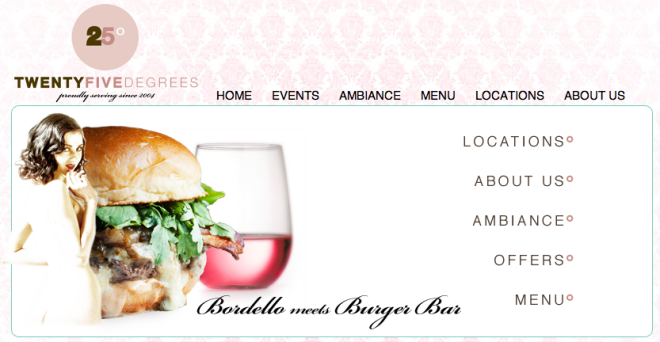
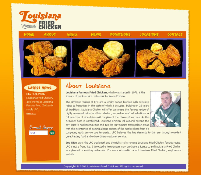
Beautiful Images
Use gorgeous photography, and your website will be attractive to visitors. Hire a professional photographer to take photos of your menu items and make sure photos are optimized.
Pleasing Colors
Consider your audience when choosing your website colors. A restaurant website geared toward 20 something’s should look visually different form a restaurant website geared toward retirees.
Color defines your restaurant website and again gives visitors a glimpse into your restaurant. Use your restaurant’s color scheme online. Carry your brand’s colors through from your restaurant interior to your online presence. Make your content easy to read. Again, consider black text on a white background. Hard to read colors lead to unattractive websites and a lack of website visitors.
Pick colors that appeal to a wide age range of website visitors.
Current Updates
This is an often overlooked part of the attractive website. When you update regularly, you remain relevant to your website’s visitors. If you ran a holiday special, make sure it comes down the day after the holiday. Update your specials the day after they expire.
Use your blog to post relevant up-to-date content. If your blog’s last post was in 2013, it’s time to work on a new post and keep them updated on a regular basis.
Consistent Site
We touched on this a bit earlier. To be attractive, your site should be consistent in layout, design and page content. (tweet this) This helps your visitors find what they are looking for. Make sure each page has the same main navigation and footer. Creating pages with different designs confuses visitors, making them lose interest, and thus leave your site.
Simplicity
Lastly, let’s discuss simplicity. Several years ago flash was exciting, and web designers were employing it everywhere. In today’s mobile landscape, flash is often annoying, and it doesn’t load on all devices. Flash can be a distraction. Either avoid overuse of flash or discontinue its use altogether.
In its place, video has the ability to increase the attractiveness of your website. Just make sure it doesn’t start playing automatically. You want to give your visitors the choice to watch.
Looking for an attractive, mobile-friendly, responsive website? Look no further! Restaurant Engine can help! Contact us today to learn more about our complete restaurant website package.
Images: mike fabio and evan
You must choose some amazing attractive theme with real photographs.
You need to make one video of your restaurant and put on your new website…